
WINNIPEG JETS 2.0 LOGOS ANNOUNCED
After months of speculation about the team name, True North Sports subtly announced that it would be the Winnipeg Jets at the NHL Draft. Today, a logo was finally released. At 4:00 pm Central Time, True North Sports uploaded the first images of the new Winnipeg Jets logos. The logos were designed around the logo of the Royal Canadian Air Force. Two secondary logos were also released along with the main crest. To see these logos, click after the jump.
Bryan Vickroy
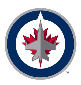
The organization had been saying all along that the new logo would be different than the original Jets logo. The color scheme is also slightly different than the original red and blue that the Jets used to use. The primary red and blue seem to be darker, and a grey/silver has been added to the scheme. A fighter jet and the Maple Leaf are the prominent features of the primary crest, and the Maple Leaf is carried into each of the secondary logos. The main logo is designed with the logo of the Royal Canadian Air Force in mind. The RCAF logo is essentially the circle and Maple Leaf emblem, minus the jet. True North Sports even found a subtle way of sneaking their own brand into the main logo. The notch in the blue circle stands for north on a compass bearing, or True North.
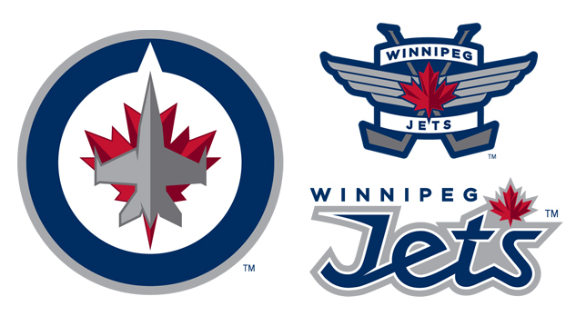
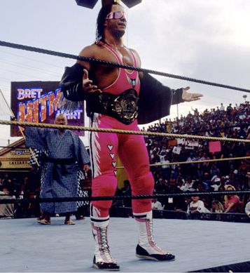
While many fans were partial to the original logos, I think i enjoy the main logo a bit more than the classic jet and hockey stick J. The logo is clean and crisp, and will be almost as recognizable as the original. However, I think True North failed a bit on the secondary logo. The crossed sticks logo makes me think of something on one of Bret “The Hitman” Hart’s jackets. The flight wings are a good idea, but it could have done without the name bars, maybe even the sticks. The “Jets” lettering reminds me of the old Colorado Sky Sox font, and also feels like sky writing/jet contrails.
All in all, I think True North did a very good job, just as they have done every step of the way so far. And so far, it sounds like Winnipeg is accepting the new logos, at least according to Illegal Curve Hockey. The next step in the branding game is jerseys. While logo merchandise is already on sale, jerseys will not even be unveiled for at least another month most likely. Rumors have said the jerseys will be seen by no later than September 11, when the team will run its rookie camp. Expect new Winnipeg Jets gear to be a big seller for the NHL this year. For continued coverage on hockey’s return to Winnipeg, The Sports Bank is your source for hockey news.
Bryan Vickroy has an addiction to hockey, and is willing to partake in all its forms. He is skating extra shifts for The Sports Bank, covering the Minnesota Wild, the NHL, and NCAA hockey all year long. Look for new articles throughout the week. He can be followed on Twitter at @bryanvickroy. If you’d prefer to speak in more than 140 characters at a time to him, he can be reached at bryan.vickroy@gmail.com .